
In today’s digital world, having a strong online presence is essential for businesses to succeed. With the rise of smartphones and tablets, people are accessing websites from a variety of devices, each with different screen sizes and resolutions. This makes it crucial for businesses to ensure their websites look great and function smoothly on any device. In 2024, the importance of responsive website design is more significant than ever. This blog will explore why responsive website design is essential for businesses looking to enhance user experience, improve SEO rankings, and stay ahead in the competitive market.
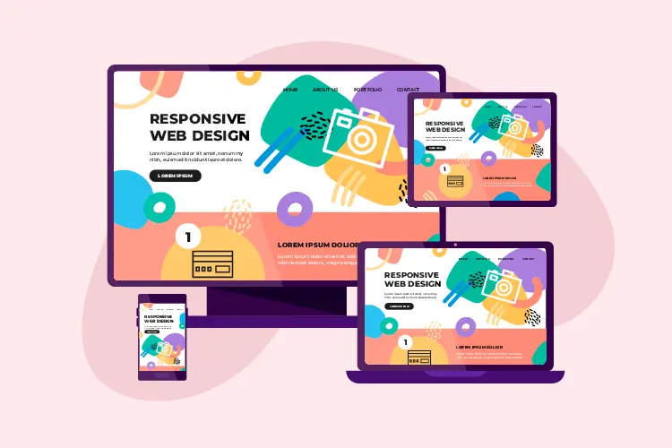
What is Responsive Website Design?
Responsive website design is an approach to web development that makes web pages render well on a variety of devices and window or screen sizes. It involves using flexible grids, layouts, images, and CSS media queries to adjust the website’s content according to the screen size, orientation, and resolution. A responsive website automatically adjusts its layout to fit the screen, whether it’s a desktop, laptop, tablet, or smartphone, providing users with an optimal viewing experience without the need for resizing or scrolling.
Why is Responsive Website Design Important in 2024?
1. Enhancing User Experience
One of the primary reasons responsive website design is crucial in 2024 is that it significantly enhances the user experience. Users today expect seamless navigation and a consistent experience across all devices. If a website isn’t responsive and requires users to zoom in and out or scroll horizontally to view content, they are likely to leave and visit a competitor’s site. A responsive design ensures that users can easily read and interact with the website’s content, regardless of the device they are using, leading to higher engagement and customer satisfaction.
2. Improving SEO Rankings
Google has long emphasized the importance of responsive website design in its search engine ranking algorithm. In 2024, having a responsive website is even more critical for SEO. Google uses mobile-first indexing, meaning it predominantly uses the mobile version of the content for indexing and ranking. Websites that are not optimized for mobile devices will likely suffer in search engine rankings. By adopting responsive website design, businesses can improve their SEO rankings, making it easier for potential customers to find them online.
3. Increasing Mobile Traffic
With the continued growth of mobile internet usage, mobile traffic now accounts for more than half of all global web traffic. In 2024, this trend is expected to continue as more people rely on their smartphones and tablets for browsing the internet. A responsive website design ensures that businesses can capture and retain mobile users, providing them with a seamless experience that keeps them engaged. Ignoring responsive design could mean losing a significant portion of potential customers who prefer using mobile devices.
4. Reducing Maintenance Costs
Maintaining separate websites for desktop and mobile versions can be costly and time-consuming. Responsive website design eliminates the need for a separate mobile site, as the website adapts to all devices. This not only reduces development and maintenance costs but also simplifies the process of updating content. Businesses can focus on managing a single website, ensuring consistency across all platforms and devices while saving time and resources.
5. Adapting to Future Devices
The digital landscape is continually evolving, with new devices being introduced regularly. A responsive website design future-proofs your website, ensuring it is compatible with any new device that comes into the market. Whether it’s a new smartphone, tablet, or wearable technology, a responsive website will adjust accordingly, providing a consistent user experience. This adaptability is crucial for businesses looking to stay ahead of the competition and cater to the changing needs of their audience.
Key Features of a Successful Responsive Website Design
1. Flexible Grid Layouts
A responsive website design uses a flexible grid layout that scales content proportionally. This grid allows elements to resize and rearrange themselves according to the screen size, ensuring that the content is always displayed optimally. Using relative units like percentages rather than fixed units like pixels is essential to achieve a fluid layout that adjusts seamlessly across different devices.
2. Media Queries
Media queries are a critical component of responsive website design. They enable the website to apply different styles depending on the device characteristics, such as screen width, height, and orientation. Media queries allow designers to specify different CSS rules for different devices, ensuring that the website looks and functions well on all screen sizes. By using media queries, businesses can create a customized experience for users on various devices.
3. Responsive Images
Images play a significant role in website design, and making them responsive is crucial. Responsive images automatically adjust to fit the size of the screen without compromising quality or performance. Using CSS techniques like max-width and media queries, images can be scaled proportionally, ensuring they load quickly and display correctly on all devices. This approach enhances user experience and prevents slow-loading pages that could drive users away.
4. Touch-Friendly Navigation
With the increase in mobile device usage, touch-friendly navigation has become a vital aspect of responsive website design. This involves designing buttons, menus, and links that are easy to tap on smaller screens. Larger touch targets, intuitive gestures, and collapsible menus are examples of touch-friendly design elements that improve usability on mobile devices. Ensuring that users can navigate the website effortlessly with their fingers enhances their overall experience.
5. Fast Loading Times
Website speed is a crucial factor in user experience and SEO rankings. A responsive website design focuses on optimizing loading times across all devices. This can be achieved by optimizing images, using efficient coding practices, leveraging browser caching, and minimizing the use of heavy scripts. Fast-loading websites provide a better user experience and are more likely to rank higher in search engine results, driving more traffic to the site.
How to Implement Responsive Website Design
1. Start with a Mobile-First Approach
A mobile-first approach involves designing the website for mobile devices first and then scaling up to larger screens. This approach ensures that the website is optimized for the most common and essential device used by users. By focusing on mobile design first, businesses can create a streamlined, user-friendly experience that can be enhanced for larger screens without compromising functionality.
2. Use Responsive Frameworks
Responsive frameworks like Bootstrap and Foundation provide a solid foundation for building responsive websites. These frameworks offer pre-designed, mobile-friendly components and grid systems that can be customized to fit the specific needs of the website. Using a responsive framework can save time and effort in the development process while ensuring a consistent and reliable responsive design.
3. Test Across Multiple Devices
Testing is a critical step in implementing responsive website design. It’s essential to test the website on various devices, including smartphones, tablets, and desktops, to ensure that it looks and functions as intended. Tools like Google’s Mobile-Friendly Test and browser developer tools can help identify and fix any issues with responsiveness. Regular testing and updates are necessary to maintain a high-quality user experience across all devices.
4. Optimize Content for Mobile Devices
Optimizing content for mobile devices involves making sure that text is easy to read, images are appropriately sized, and navigation is straightforward. Content should be concise, and essential information should be highlighted to capture the user’s attention quickly. Using larger fonts, clear headings, and sufficient spacing can improve readability and make the content more accessible on smaller screens.
5. Monitor and Analyze Performance
Once the responsive website design is implemented, it’s important to monitor its performance regularly. Tools like Google Analytics can provide insights into how users interact with the website on different devices, which pages are most popular, and where users may be dropping off. By analyzing this data, businesses can make informed decisions to improve the website’s design and functionality, ensuring a better user experience and higher engagement.
Conclusion
In 2024, the importance of responsive website design cannot be overstated. As more people access the internet through a variety of devices, businesses must ensure their websites provide a seamless and consistent experience across all platforms. Responsive website design enhances user experience, improves SEO rankings, increases mobile traffic, reduces maintenance costs, and adapts to future devices. By implementing responsive design principles, businesses can stay ahead of the competition, attract more customers, and build a strong online presence.
Check out our last blog on How to Create a User-Friendly Mobile App Interface